
This project is a visual identity system designed for a non-profit organization dedicated to empowering neurodivergent children (ASD, ADHD), families, and educators. The branding bridges empathetic human-centered research with structured design architecture to create an accessible, empowering identity.

SUPPORTING NEURODIVERSITY:
A PLAYFUL EMPOWERING IDENTITY FOR ALTERNATIVE EDUCATION
about
Traditional educational and non-profit branding often relies on overly chaotic graphics, loud primary palettes, or clinical aesthetics that cause sensory fatigue and cognitive overload for neurodivergent audiences. J2L required a visual system that eliminates visual friction, fostering emotional safety, clarity, and trust without sacrificing professional authority.
STRATERGY
1 Grounded in a neuro-inclusive design framework, the direction prioritizes sensory balance, modular flexibility, and cognitive clarity. By converting complex educational journeys into intuitive, shape-driven symbolic languages, reassuring and structured across every touchpoint
2 This design direction recognizes that neurodivergence is a natural spectrum—transforming complex educational touchpoints into reassuring, adaptive pathways
logo
The J2L logo mark is a dynamic, shape-driven geometric emblem representing adaptive learning pathways, growth, and connection. Constructed with clear form geometry, it symbolises individual progress within a supportive framework.

Alternative lock-up of the logo.

Alternative lock-up of the logo.

Alternative lock-up of the logo.


colour
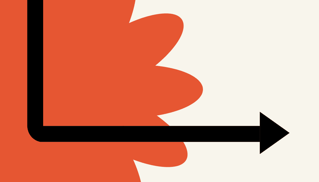
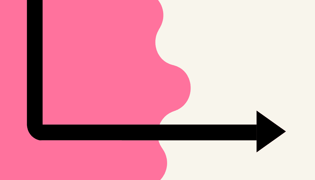
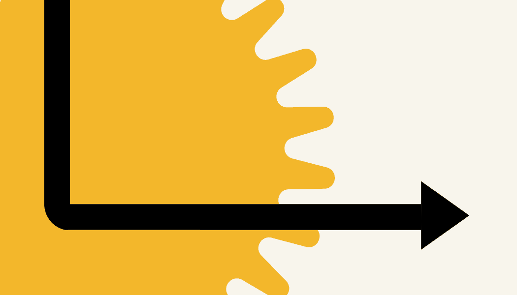
Neurodivergence is part of nature it exists within the wonder of nature, just like their minds. Shapes and colors are derived from elements of nature- yellow sun, blue clouds, green bush, pink for the mind and the purple thought bubble representing wonder. The palette pairs calming base tones with high-contrast accent swatches. This controlled contrast strategy prevents visual strain and sensory overstimulation while clearly guiding user attention.
Brand colours
Lavender
HEX #9EC3D8
RGB 158 195 216
CMYK 27 10 0 15
HSL 202 43% 73%
Pantone 545 C
pink
HEX #E8E6DC
RGB 232 230 220
CMYK 0 1 5 9
HSL 50 21% 89%
Pantone Warm Gray 1 C
sky blue
HEX #F3CD86
RGB 243 205 134
CMYK 0 16 45 5
HSL 39 82% 74%
Pantone 7403 C
vermellion
HEX #3D0202
RGB 61 2 2
CMYK 0 97 97 76
HSL 0 94% 12%
Pantone 4975 C
bright green
HEX #F3CD86
RGB 243 205 134
CMYK 0 16 45 5
HSL 39 82% 74%
Pantone 7403 C
golden yellow
HEX #F3CD86
RGB 243 205 134
CMYK 0 16 45 5
HSL 39 82% 74%
Pantone 7403 C
Patterns & forms


Typography
It has been used to create custom characters for the logo.The typographic system combines a highly legible, accessible primary sans-serifs. Built with generous character spacing and strong vertical rhythm, the typography reduces reading friction and enforces clear visual hierarchy for neurodivergent users.
PRIMARY TYPE / Tw Cen MT Condensed
SECONDARY / Monserrat Light

ASSETS
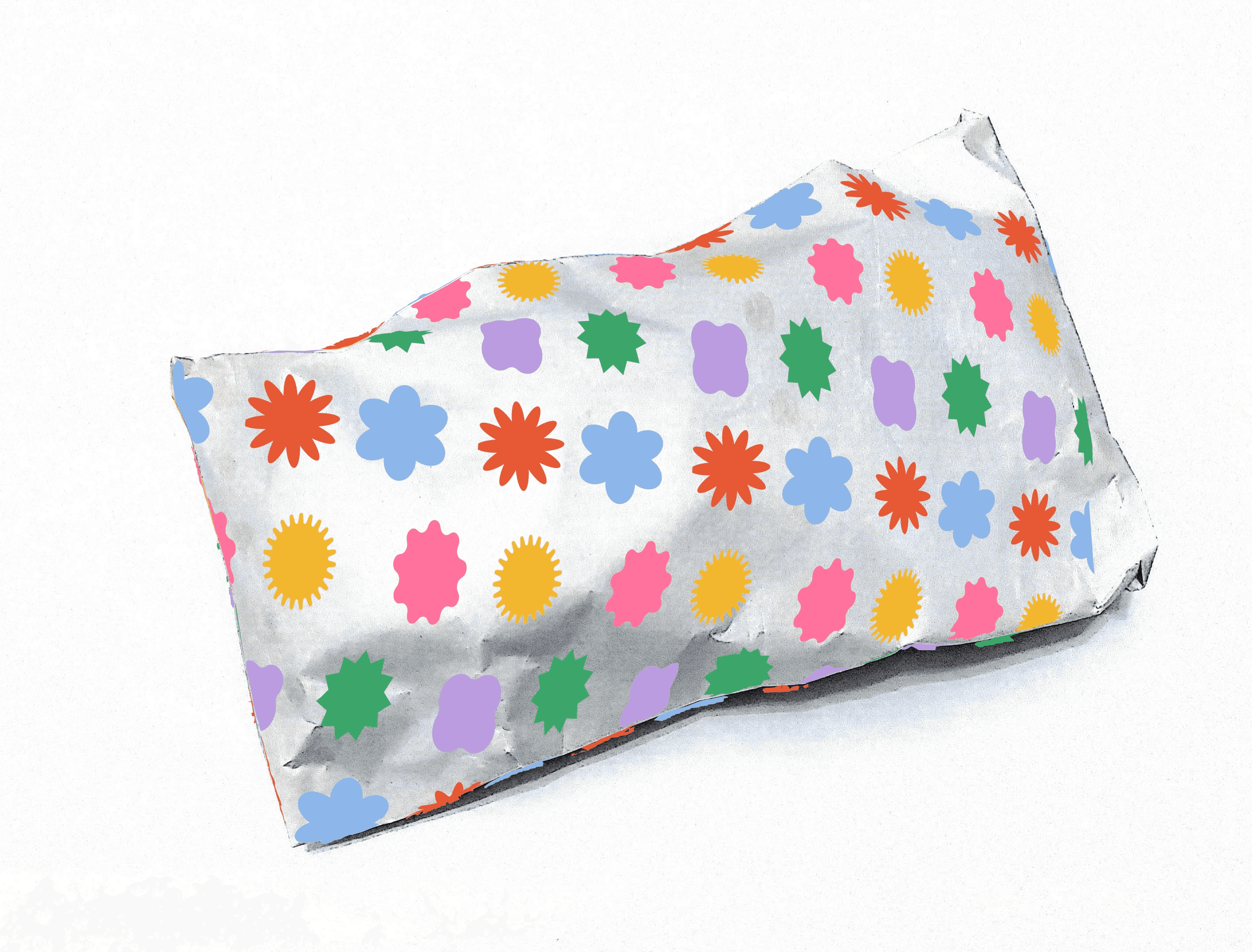
The identity includes custom glyph and icon library, educational kit materials, id cards for staff and packaging for sensory toys as tools to manage stimming.





BRAND IN USE


This project is a visual identity system designed for a non-profit organization dedicated to empowering neurodivergent children (ASD, ADHD), families, and educators. The branding bridges empathetic human-centered research with structured design architecture to create an accessible, empowering identity.
SUPPORTING NEURODIVERSITY:
A PLAYFUL EMPOWERING IDENTITY FOR ALTERNATIVE EDUCATION
about
Traditional educational and non-profit branding often relies on overly chaotic graphics, loud primary palettes, or clinical aesthetics that cause sensory fatigue and cognitive overload for neurodivergent audiences. J2L required a visual system that eliminates visual friction, fostering emotional safety, clarity, and trust without sacrificing professional authority.
STRATERGY
1 Grounded in a neuro-inclusive design framework, the direction prioritizes sensory balance, modular flexibility, and cognitive clarity. By converting complex educational journeys into intuitive, shape-driven symbolic languages, reassuring and structured across every touchpoint
2 This design direction recognizes that neurodivergence is a natural spectrum—transforming complex educational touchpoints into reassuring, adaptive pathways
logo
The J2L logo mark is a dynamic, shape-driven geometric emblem representing adaptive learning pathways, growth, and connection. Constructed with clear form geometry, it symbolises individual progress within a supportive framework.
Alternative lock-up of the logo.
Alternative lock-up of the logo.
Alternative lock-up of the logo.
colour
Neurodivergence is part of nature it exists within the wonder of nature, just like their minds. Shapes and colors are derived from elements of nature- yellow sun, blue clouds, green bush, pink for the mind and the purple thought bubble representing wonder. The palette pairs calming base tones with high-contrast accent swatches. This controlled contrast strategy prevents visual strain and sensory overstimulation while clearly guiding user attention.
Brand colours
Lavender
HEX #9EC3D8
RGB 158 195 216
CMYK 27 10 0 15
HSL 202 43% 73%
Pantone 545 C
pink
HEX #E8E6DC
RGB 232 230 220
CMYK 0 1 5 9
HSL 50 21% 89%
Pantone Warm Gray 1 C
sky blue
HEX #F3CD86
RGB 243 205 134
CMYK 0 16 45 5
HSL 39 82% 74%
Pantone 7403 C
vermellion
HEX #3D0202
RGB 61 2 2
CMYK 0 97 97 76
HSL 0 94% 12%
Pantone 4975 C
bright green
HEX #F3CD86
RGB 243 205 134
CMYK 0 16 45 5
HSL 39 82% 74%
Pantone 7403 C
golden yellow
HEX #F3CD86
RGB 243 205 134
CMYK 0 16 45 5
HSL 39 82% 74%
Pantone 7403 C
Patterns & forms
Typography
It has been used to create custom characters for the logo.The typographic system combines a highly legible, accessible primary sans-serifs. Built with generous character spacing and strong vertical rhythm, the typography reduces reading friction and enforces clear visual hierarchy for neurodivergent users.
PRIMARY TYPE / Tw Cen MT Condensed
SECONDARY / Monserrat Light
ASSETS
The identity includes custom glyph and icon library, educational kit materials, id cards for staff and packaging for sensory toys as tools to manage stimming.
BRAND IN USE
This project is a visual identity system designed for a non-profit organization dedicated to empowering neurodivergent children (ASD, ADHD), families, and educators. The branding bridges empathetic human-centered research with structured design architecture to create an accessible, empowering identity.
SUPPORTING NEURODIVERSITY:
A PLAYFUL EMPOWERING IDENTITY
FOR ALTERNATIVE EDUCATION
about
Traditional educational and non-profit branding often relies on overly chaotic graphics, loud primary palettes, or clinical aesthetics that cause sensory fatigue and cognitive overload for neurodivergent audiences. J2L required a visual system that eliminates visual friction, fostering emotional safety, clarity, and trust without sacrificing professional authority.
STRATERGY
1 Grounded in a neuro-inclusive design framework, the direction prioritizes sensory balance, modular flexibility, and cognitive clarity. By converting complex educational journeys into intuitive, shape-driven symbolic languages, reassuring and structured across every touchpoint
2 This design direction recognizes that neurodivergence is a natural spectrum—transforming complex educational touchpoints into reassuring, adaptive pathways
logo
The J2L logo mark is a dynamic, shape-driven geometric emblem representing adaptive learning pathways, growth, and connection. Constructed with clear form geometry, it symbolises individual progress within a supportive framework.
Alternative lock-up of the logo.
Alternative lock-up of the logo.
Alternative lock-up of the logo.
colour
Neurodivergence is part of nature it exists within the wonder of nature, just like their minds. Shapes and colors are derived from elements of nature- yellow sun, blue clouds, green bush, pink for the mind and the purple thought bubble representing wonder. The palette pairs calming base tones with high-contrast accent swatches. This controlled contrast strategy prevents visual strain and sensory overstimulation while clearly guiding user attention.
Brand colours
Lavender
HEX #9EC3D8
RGB 158 195 216
CMYK 27 10 0 15
HSL 202 43% 73%
Pantone 545 C
pink
HEX #E8E6DC
RGB 232 230 220
CMYK 0 1 5 9
HSL 50 21% 89%
Pantone Warm Gray 1 C
sky blue
HEX #F3CD86
RGB 243 205 134
CMYK 0 16 45 5
HSL 39 82% 74%
Pantone 7403 C
vermellion
HEX #3D0202
RGB 61 2 2
CMYK 0 97 97 76
HSL 0 94% 12%
Pantone 4975 C
bright green
HEX #F3CD86
RGB 243 205 134
CMYK 0 16 45 5
HSL 39 82% 74%
Pantone 7403 C
golden yellow
HEX #F3CD86
RGB 243 205 134
CMYK 0 16 45 5
HSL 39 82% 74%
Pantone 7403 C
Patterns & forms
Typography
It has been used to create custom characters for the logo.The typographic system combines a highly legible, accessible primary sans-serifs. Built with generous character spacing and strong vertical rhythm, the typography reduces reading friction and enforces clear visual hierarchy for neurodivergent users.
PRIMARY TYPE / Tw Cen MT Condensed
SECONDARY / Monserrat Light
ASSETS
The identity includes custom glyph and icon library, educational kit materials, id cards for staff and packaging for sensory toys as tools to manage stimming.


BRAND IN USE
